Primarily, we come
across 2 types of brands, one that can be guessed just from a single colour or
a pattern, sometimes even without a logo. On the other hand, a few brands can
only be identified on revealing their logo or a trademark.
That brings us to the
question, why are some brands so easily recognizable while some aren’t?
What makes few brands
easier to identify and resonate with?
The answer to these
questions lies in the Colour Psychology that marketer’s employee when branding their
good and services.
What is brand
colour psychology?
Brand colour psychology is the study of how colour impacts
the way we perceive brands. Colors have a powerful effect on our emotions and these emotions
play a major role in how we behave as consumers.
Brand colour psychology
provides a framework for understanding how and why we interact with the brands
in our lives.
Every colour has a
positive and negative connotation and the final positioning of the brand
instigates your perception of the brand. For example, the colour Red, can have
a negative implication such a danger but can also imply a positive emotion like
love. The way the marketers position their brands in the market, the way they judiciously
use their colour scheme and the way they work around the designing and the logo
will ultimately determine the success of the brand.
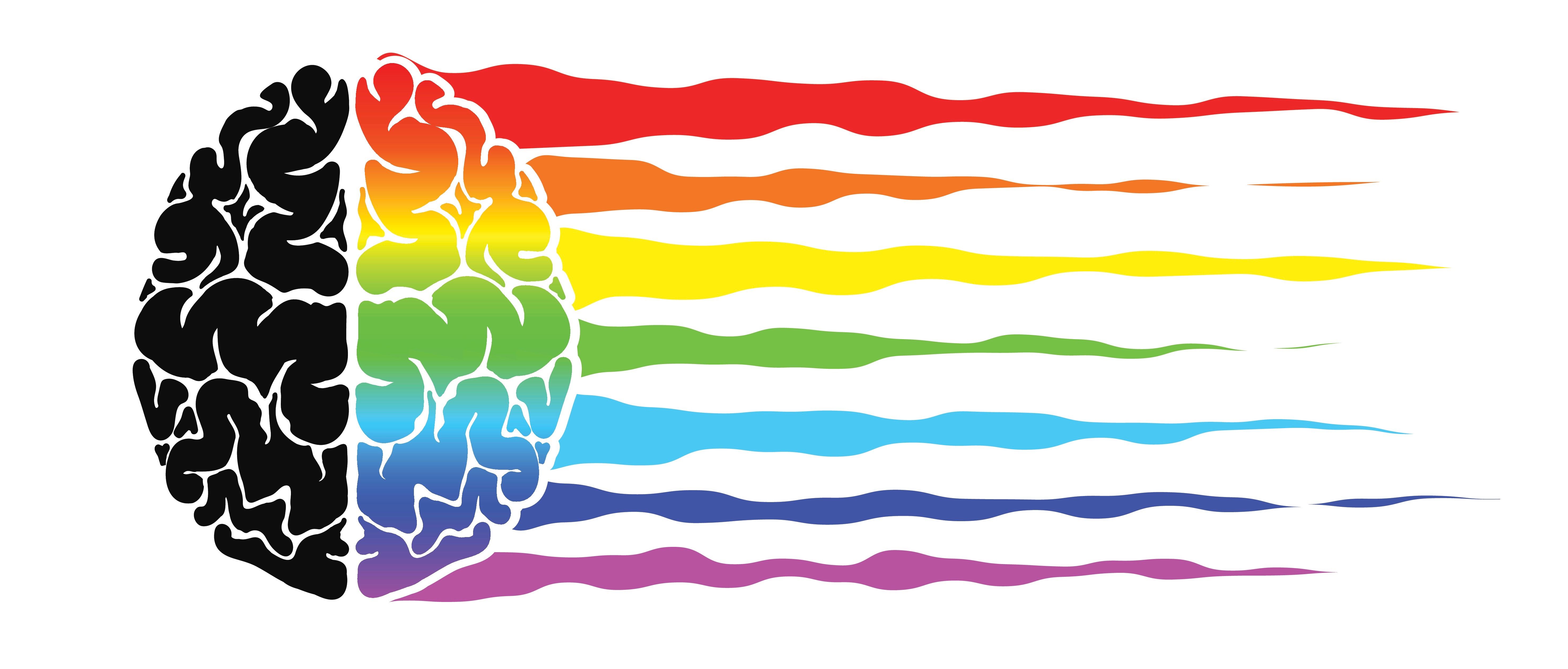
Influence of
various colors
A logos colour can be
intrinsically linked to the business’s identity and how people connect with the
brand. Colors in your logo, packaging and signage can make your customers
either love your brand or overlook it.
Let’s have a look at
different colors and how they have powerfully impacted consumer behaviour and
decision making.
Color Psychology
of Red

Red creates a sense of
urgency and is associated with excitement and passion. However, the colour red’s
effect on the psyche are not subtle. Therefore, it is important to use it with
utmost care for branding purposes.
Examples of the
usage of the Red Colour
1. Red is used on clearance sale price tags, to instill a feeling of excitement and to help speed up and intensify reactions.
2. The logo of the predominant chain of fast-food, McDonalds is oozing with the colour Red, as it is said to increase appetite.
3. Red is associated with conservatism; thus, it finds its presence on every banner of communism and socialism.
Colour psychology of Yellow

Source - Logo Maker
Yellow is often associated with happiness, cheerfulness and fun. The colour Yellow is said to best compliment the colour Red. A very successful example of this combination is the logo and design of McDonalds that stimulates appetite and creates a sense of excitement.
Owing to its
relatively long wavelength, it’s one of the most visible colors which makes its
further stimulating and attention-grabbing.
Yellow colour often
finds its presence on advertisement hoardings, legal pads, warning symbols and
traffic lights.
Colour psychology of Green

Source - Tailor Brands
Green is associated
with health, tranquility, power and nature. It is said to soothe and relax the customers.
Green also helps to inculcate a sense of environmental friendliness.
Starbucks Coffee has
endorsed the colour Green ever since its inception with an aim to promote a
sense of comfort and relaxation in its cafes, thus inviting customers to come
in for a coffee break.
Colour psychology of Blue

Source - Marketing Minds
Blue is associated
with calm, aqua, trust and reliability. It offers a sense of security, curbs appetite
and stimulates productivity.
American Express uses
the colour blue on all its credit and debit cards to instill their customers
with feelings of security and trust in the brand.
Similarly, all aqua-guard
brands like Eureka Forbes have their logos and brands inscribed in the colour
blue for 2 purposes, one is conveying the obvious message of a water provision
and two, it conveys the message of safety, purity and protection whilst
consuming water.
Colour psychology of Purple

Source - Brand Crowd
Purple is associated
with royalty, wisdom and respect. It stimulates problem-solving as well as
creativity. It is popularly used for promoting beauty and anti-ageing products
too.
For example, Hallmark’s
purple logo is depicted with a crown.
Colour psychology of Black

Source - 99 Designs
Black is allied with
authority, power, stability, confidence and strength.
Nike’s logo mainly
uses black and white colors to evoke power, strength, stability and
intelligence.
Now, that we have enough knowledge about the colour psychology that aids in brand development and positioning, we must ask ourselves,
“Does my brand colour
resonate with my business?”
If yes, then you’ve successfully commenced
your journey to success.
If not, rethink your
colour strategy, redesign your logo, choose colors that compliment each other, go
for subtlety and find a prudent colour connotation for your brand.
Written By - Tushna Choksey


0 Comments